

Context
In an effort to reduce return and exchange related customer service tickets, the e-commerce company I worked with partnered with a vendor to implement a self-service return and exchange portal. I was brought on to help facilitate the implementation.
A requirement for this project was to create onsite entry points to the portal. The business assumed we could achieve this by redirecting current returns and exchange links. Through the UX process, I found that this approach would create more problems. With the data I collected and mocks I created, I was able to challenge that assumption and get buy in for a different approach.
Role
Lead Product Designer (in-house)
UX Methods
Data Analysis • Stakeholder Interviews • Secondary Studies • User Flows • Competitive Analysis • Wireframing • Prototyping
Team
1 Product Manager • 3 Developers • External Vendor
Project Type
Commercial
Year
2023
Duration
4 weeks (Design Only)
Goal / KPIs
Decrease in return/exchange related customer service tickets
Flat customer satisfaction score (CSAT)
Problem
I discovered that our onsite help experience was fractured. This created friction for users trying to get help. It also created unnecessary maintenance resulting in wasted time for the company. By implementing the business' assumption (redirecting current return and exchange links to the return portal), it would worsen the situation.

Depending on which channel the user came from, they would have a different help experience.
Solution
With the data I collected and mocks I created, I was able to get buy in for a different approach to the return portal entry points. This approach involved centralizing the entire help experience around a series of figurative questions. Results are pending as the project is still in development.
I redesigned our help experience to ensure that users have the same help experience regardless of where the user enters the flow.

A GIF showcasing the system I created. It illustrates the user's journey of initiating a return/exchange starting from an email.
*To maintain professional integrity, I’ve omitted certain details from this case study and recreated the mocks with a fictional brand*
I became involved in the project when my manager assigned me a brief. The goal was to have users making a return or exchange utilize the returns portal instead of contacting customer service.
One of the requirements for the project was to create onsite entry points to the returns portal. The business assumed that we could redirect our current returns and exchange links to the portal.
Research Goals:
Evaluate all the possible paths users can take to make a return or exchange.
Identify the most common paths users were taking to make a return or exchange.
Identify the expected entry points.

I created a user flow to identify and map out all the paths a user can take to make a return or exchange.
What I learned:
Returns and exchanges span various channels, including email and external search engines.
A lot of paths forced users to see irrelevant information (e.g., Returns FAQ article).

I reviewed our analytics and spoke to our customer service team to identify the most common paths our users were taking to make a return or exchange.
What I learned:
A majority of users performing a return/exchange came from external search engines.
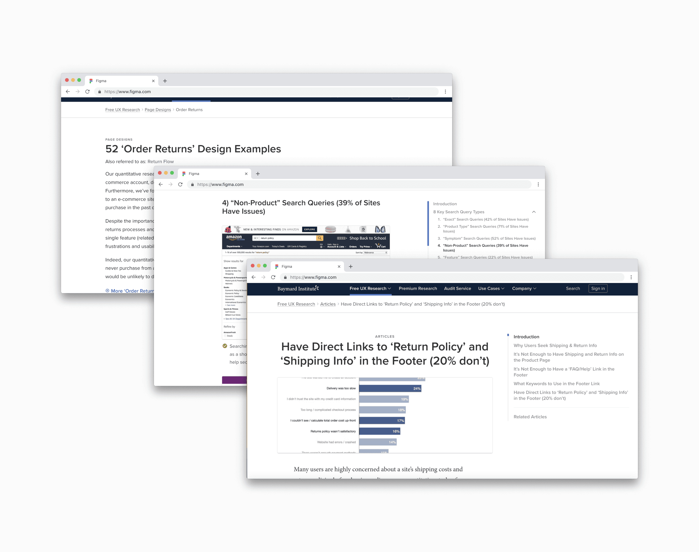
I looked at Baymard studies to identify any expected entry points that we might be missing. Due to the lack of resources, I had to rely on these existing studies instead of conducting our own.
What I learned:
We were missing three key onsite entry points - the footer, account page, and search.
It forced users to see irrelevant information
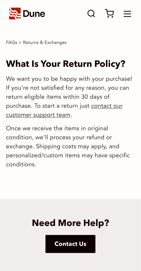
Users coming from search engines or email must navigate through the FAQs, find the return’s article, then click the return's link to enter the portal link. Not all users need to see the information in the returns article.

It broke existing functionality
We would also have to redirect users on the contact us form. However, this compromises the feature's efficiency and goes against user expectation. On this page, users expect to be able to send a message.


It deepened the divide between mobile and desktop experiences
The help drill down is missing on small screens. So a link to the returns portal would only be available on the large screen navigation and not small screens.


Over time, we piecemealed our help experience together. This created a different help experience for every part of the site. The account, the footer, and the navigation all had a different set of help options. By solving for this, we'd create the best long term solution while also fulfilling the project requirement.
I looked at multiple e-commerce sites.
What I learned:
The sites with the best help experiences have a centralized home base for help.


Everlane’s help experience (left) and Patagonia’s help experience (right) both have a home base for their help experience.

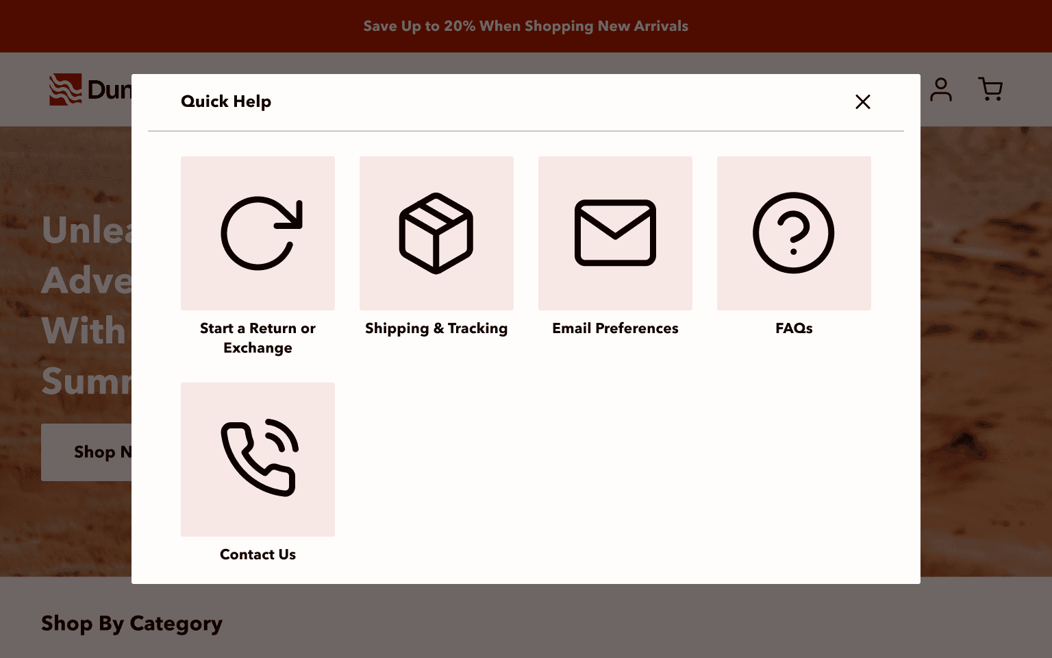
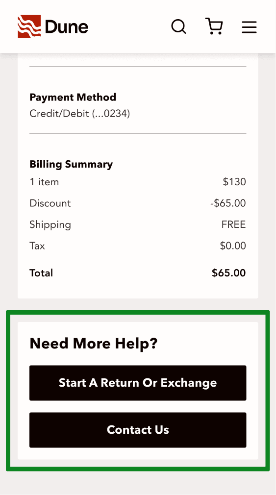
I had the idea of creating a modal filled with cards for help center's “greatest hits”. This help modal would be reusable. Any place where we think help is necessary we’ll add a CTA to “get help”. When the user engages with the CTA, this modal will appear.
There were problems with only using a modal:
If a user comes from a different channel (e.g., email or search engines), it’d be technically difficult to open a modal.
Opening a modal upon entry would create a negative effect on SEO.
Replacing the flyout with a modal on the navigation breaks the design pattern we established.
The new help experience involves asking users figurative questions during their journey. Although the components used may vary slightly based on their starting point, the overall experience remains consistent. The project is still in the development phase, so results are pending.
Original Flow
Each entry point had a different help experience.
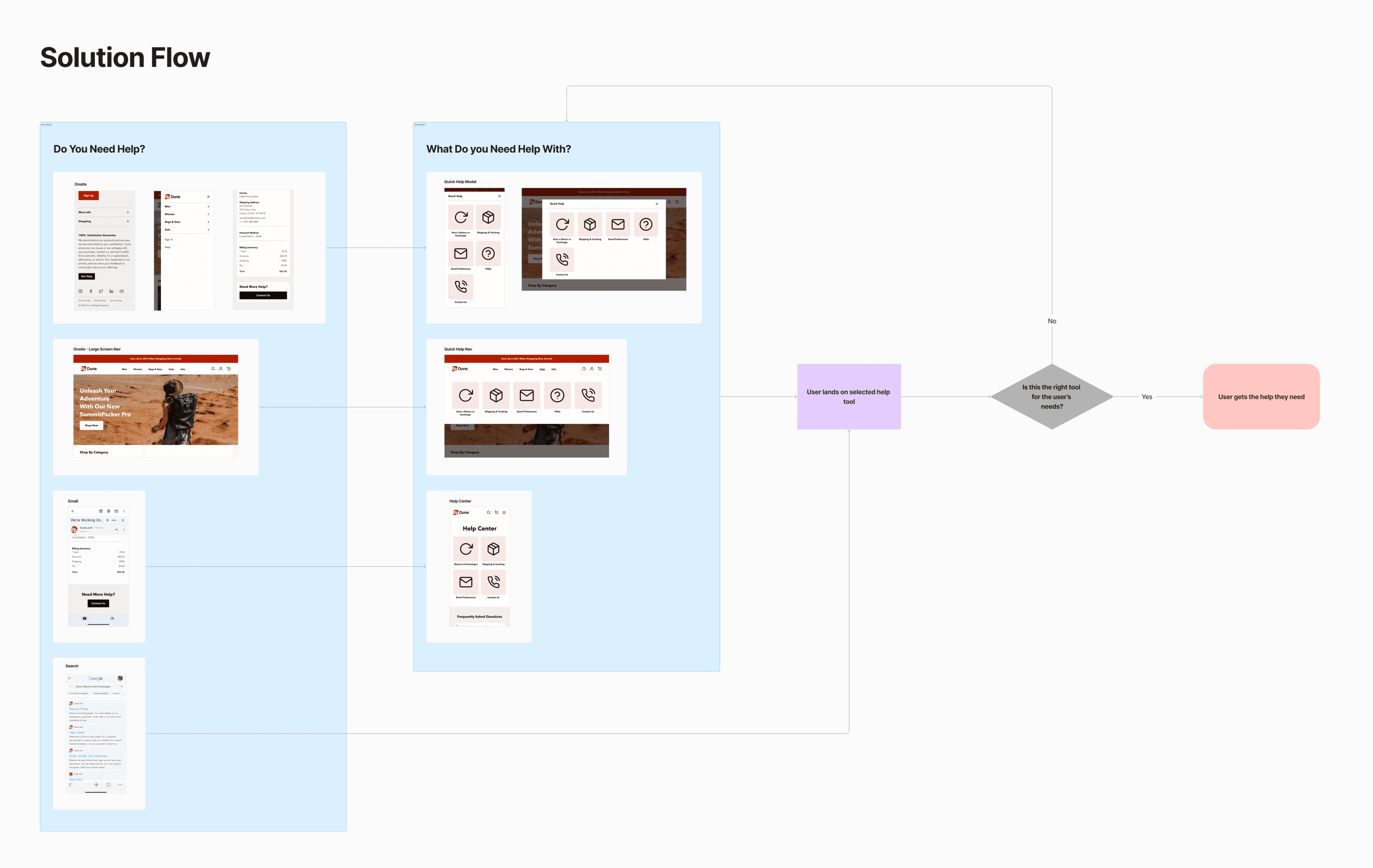
Solution Flow
I created a system that ensures the user has the same help experience regardless of where the user enters the flow.
A GIF showcasing the system I created. It illustrates the user's journey of initiating a return/exchange starting from an email.
Recognizing the difficulty of explaining the pitfalls of the business' assumption, I used my research and the mocks I created to convey my thoughts. The analytical data helped them understand how many users are affected by this fracture. The user flows conveyed how it was difficult for us to maintain our current help experience. Then having mocks for them to look at helped them understand the tradeoffs and benefits of each solution.
Removing the help link from the navigation

Based on my competitive analysis, not having help in the navigation is common. It seems that most users know to go to the footer if they need it. The user flows show that having help in the navigation just causes clutter because it gives us an extra experience to maintain. By removing it from the navigation, we can feasibly further streamline our help experience without negatively affecting our customers.


